Showing posts with label ink. Show all posts

PRESS :: WEDDING CHICKS

I was delighted to have a recent collaboration with Kristy Rice of Rice Ink appear on Wedding Chicks earlier this week. The stunning images for Munaluchi Bridal Magazine on new stands later this month are by the unbelievably talented Elizabeth Messina. Check out a handful of the photos below, or head here to see the full post!


Photography: Elizabeth Messina
Hair/Makeup:  Erin Skipley
Shoes: Aruna Seth courtesy of Pistol and Stamen
Fashion Styling: Eronmwon Balogun
Assistant Stylist:  Laura Wise
Floral Design and Styling: Dolce Designs Studio
Lingerie:  Claire Pettibone
Hair Accessories: Twigs and Honey & Jannie Baltzer
Sashes/Accessories: Desla Couture
Jewelry: Garvey Lundy
Stationery:  Kristi Rice of Rice Ink
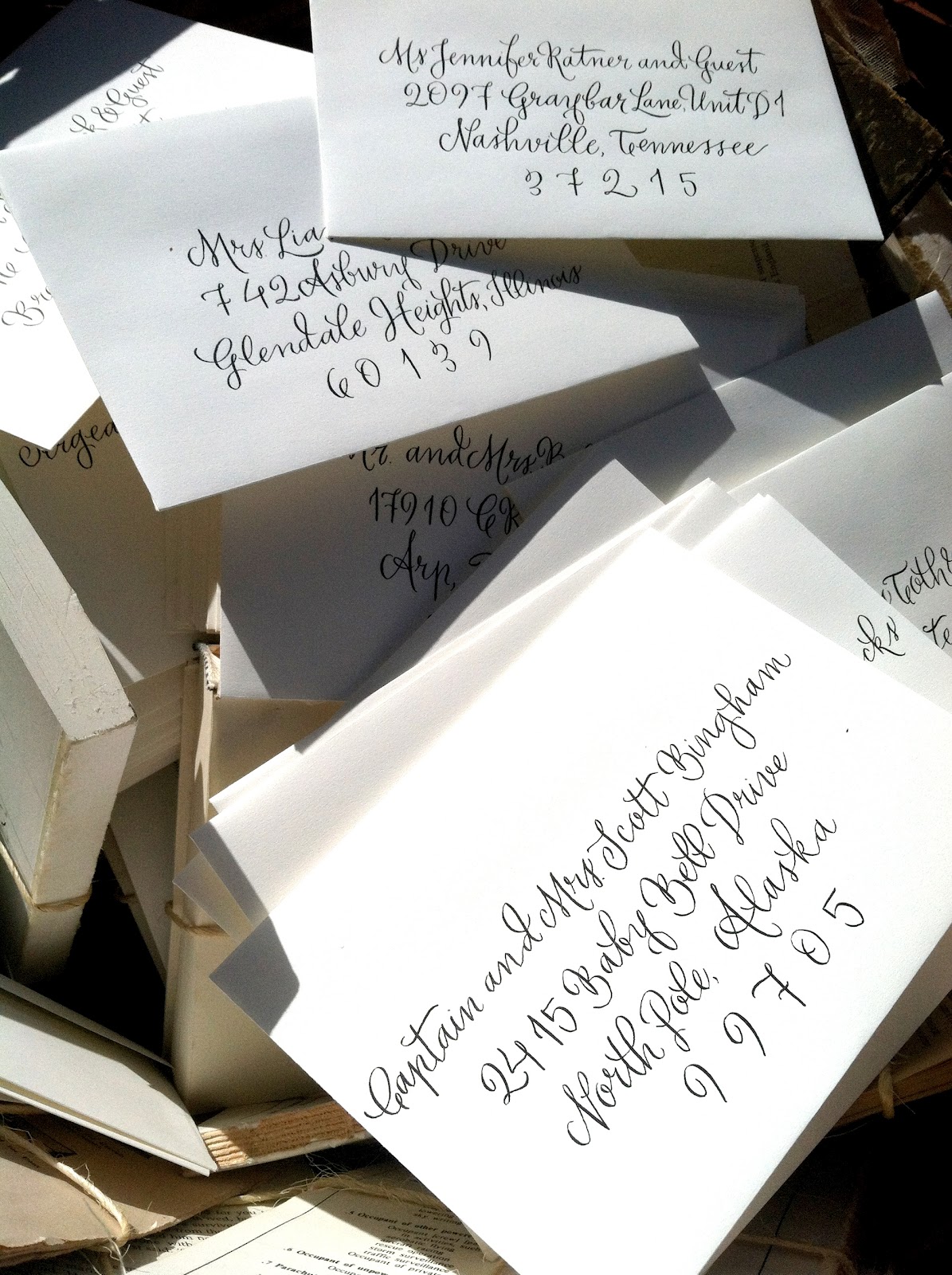
Calligraphy: Hardink Calligraphy
Production/Produced By: Be Inspired PR

NASHVILLE WEDDING PLANNERS GROUP

I recently had the opportunity to show my work to the fabulous members of the Nashville Wedding Planners Group.  The June meeting featured myself along with a handful of other local wedding vendors.

Prior to the meeting they asked me to letter an invitation to be sent out to all of the planners.  For the invitation itself I wanted something fun and unique, so I went with the Harper style of lettering.  For the envelopes I chose a bright green ink and mixed the Harper and Ford styles.


The meeting itself was a wonderful opportunity to show off some of my latest work to this group of fabulous planners who are making waves through the Nashville wedding scene.  I am lucky to have some gorgeous images of the evening courtesy of the talented Kristyn Hogan.


Thanks to the NWPG for asking me to get involved!

The LOPES 2

As wedding season continues to tumble through the lazy days of summer, I get more and more requests for envelopes.  I think the fall wedding season will be in full force!  I've been so happy to have the opportunity to work on a few new styles in a couple new colors.  As much as I love a classic (and always gorgeous) traditional black on ecru envelope, it's always exciting to dip my quill into some gold or deep green ink!

Enjoy!


PRESS :: CHARLESTON WEDDINGS

 As evident by my lack of recent blog posts, I've been extremely busy over the last couple of months!  In the midst of all the chaos I was extremely excited when Katherine Miller of Katherine Miller Events in Charleston, South Carolina contacted me about working with her on a tablescape she was creating for an article in the summer 2012 issue of Charleston Weddings magazine.  Obviously my answer was DUH! I'd love to help!  Katherine created a gorgeous Vintage Prep themed sweetheart tablescape with a color pallet that will knock your socks off and I happily provided the lettering for the place cards, favors, table number, and chair signs.  


You can read the entire article in the summer issue or by going to their website here.  And you can read Katherine's blog post about her experience here.  Special thanks to Katherine for asking me to help, it was such a blast!

All photographs pictured above are courtesy of Charleston Weddings 2012 Summer Issue and were taken by Peter Frank Edwards.  

The LOPES

Over the last month my life has been generally consumed by what my husband and I fondly refer to as "the lopes."  ENVELOPES.  Obscene amounts of envelopes.  1,286 envelopes to be exact.  Yes.  You did read that correctly.  Seven different styles in five different colors, sometimes starting at 5am and ending at midnight.  I wish I could say that I enjoyed every minute it of it, but I won't lie, there were definitely WHAT WAS I THINKING?!?! moments.  But, as I sent the last shipment out, I felt good, accomplished, and better educated about what I can and can't handle (physically and mentally!) in terms of my work load.  A few tears and thumb cramps and countless hand rubs later, I am happy to say I have seven happy brides, and one happy (but tired) calligrapher!  

I promise to do more specialized posts on everything, but for now, here's a sneak peak at THE LOPES!


WOOD VENEAR SAVE THE DATES


I am so excited to show you these beautiful and unique Save The Dates that I have been working on with Hillary of Brocade Designs.  My calligraphy was set in the hand-drawn image of a leaf and then printed on the gorgeous wood veneer material and sent in a wooden envelope featuring a custom mailing label.  Absolute eye candy!  I am itching to show you the rest of the pieces we worked on for this May wedding in Ringgold, Louisiana, but you'll have to wait just a little bit longer.  For now, you can just salivate over these beautiful images from Donald Yeager Photography borrowed from Brocade.  Enjoy!

BEACHY BACHELORETTE PARTY INVITATION

I think it's pretty clear that the majority of the projects that I get most excited about are ones that I've never done before.  There's something especially fun about creating something for someone that is outside of the realm of things that I've done before.  That's why when I was asked to create some bright and beachy invitations for a bachelorette party I was thrilled.  She wanted bright corals and teals with a relaxing beach vibe.  I felt like doing the entire invitation in calligraphy would detract from the gorgeous simplicity, so I decided to highlight some of the details in calligraphy and leave the rest in a thin and casual block.  I did some bold shells to pop off the white invitations and then closed them up in a vibrant blue pocket card and tied everything nicely together with some sandy yellow baker's twine.  I think they turned out pretty wonderful myself, what do you think?